
Lync HumanEdge, performance made visible.
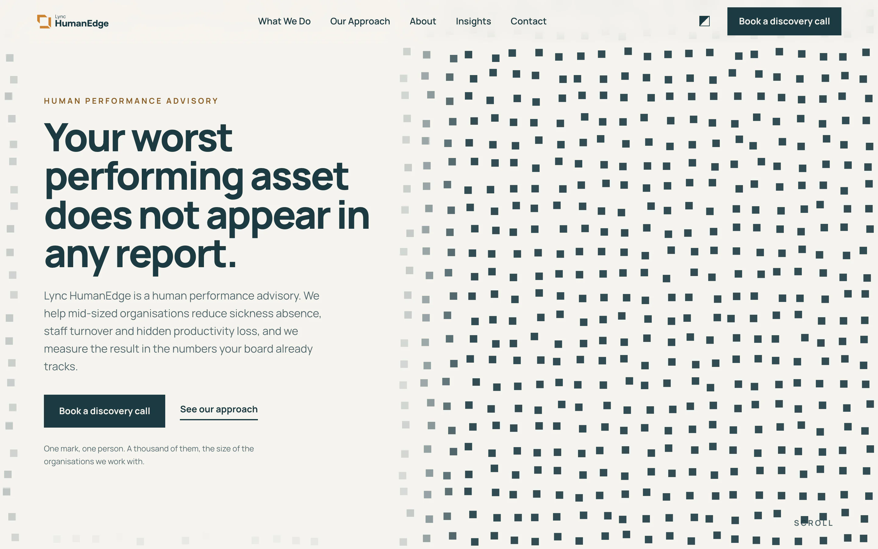
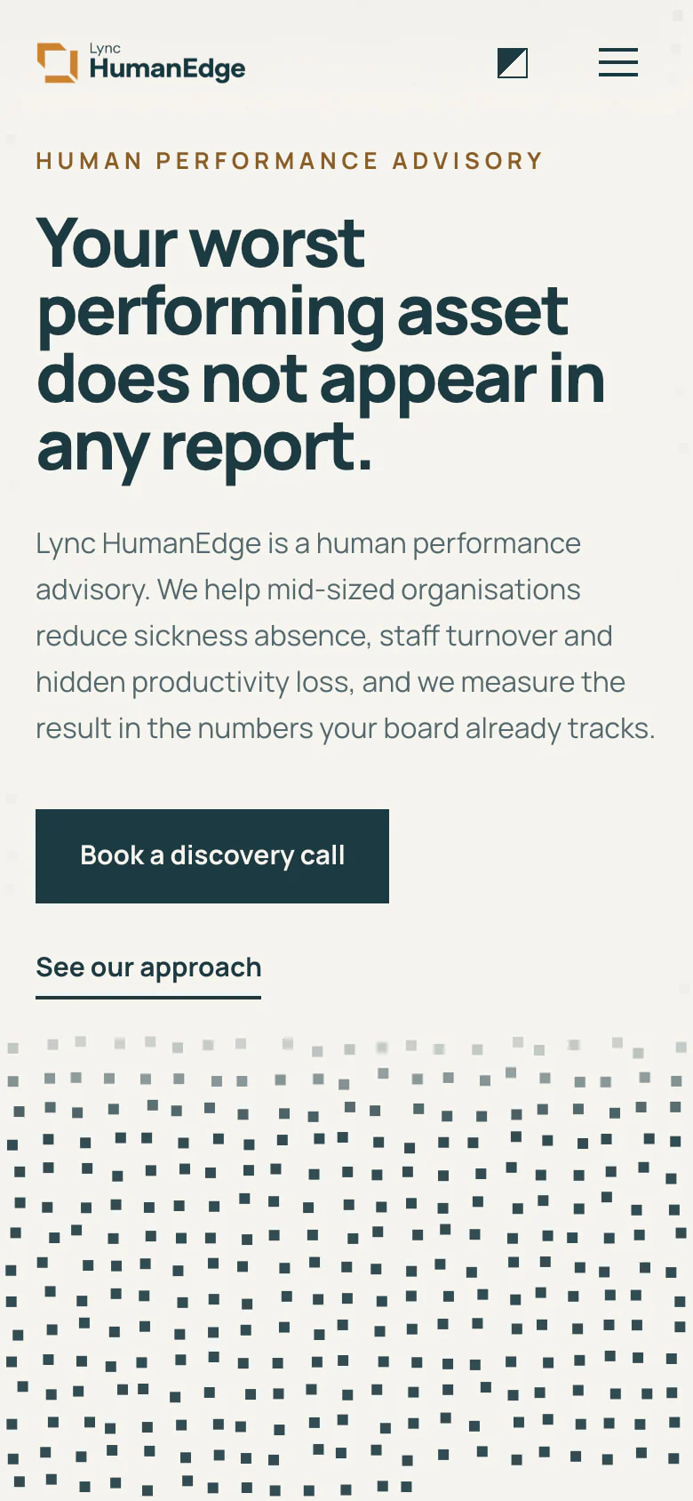
Lync HumanEdge is a UK human performance advisory: it measures what a workforce costs, then moves the number. From the first call to the finished site, our team made all of it: the brand, the words, the design, the code, the content and the search. Its homepage draws the whole argument in a thousand marks, one per person, where absence shows as a gap.
- Client
- Lync HumanEdge, United Kingdom
- What we did
- Brand, copy, design, development, content and search
- When
- July to September 2026
Where it started
The record was Lync's own: Lync HumanEdge is built on Lync Wellbeing, which has delivered workplace health to UK organisations since 2010. The new advisory takes that into the boardroom of organisations of 100 to 1,000 people. It needed a brand and a website that make the case in a board's own terms, and one team to make all of it. What stood in the way:
- An audience of managing directors who read a P&L every month and a health report never.
- Figures on the cost of poor health that travel from deck to deck, some of them supported by no published source.
The brand
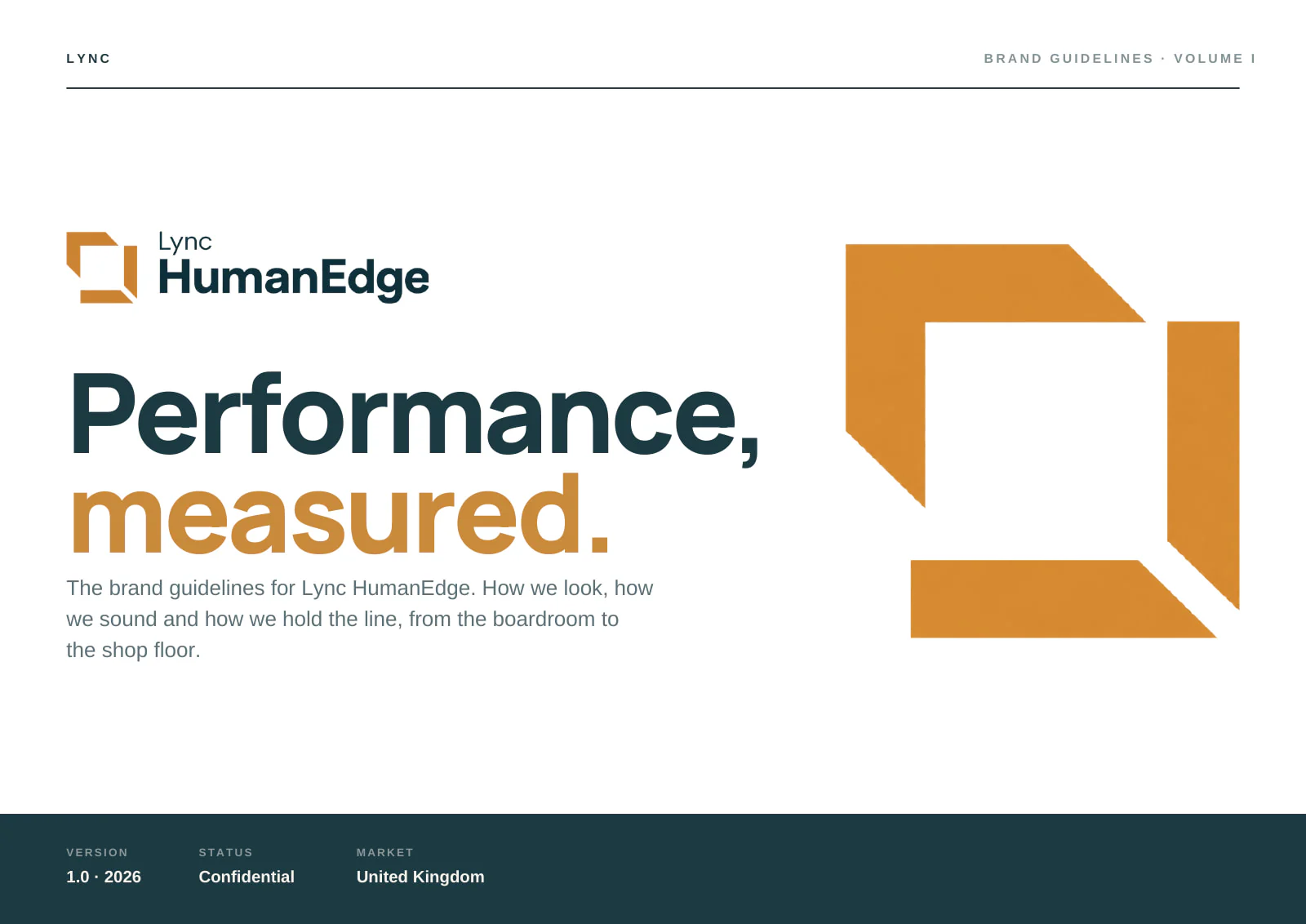
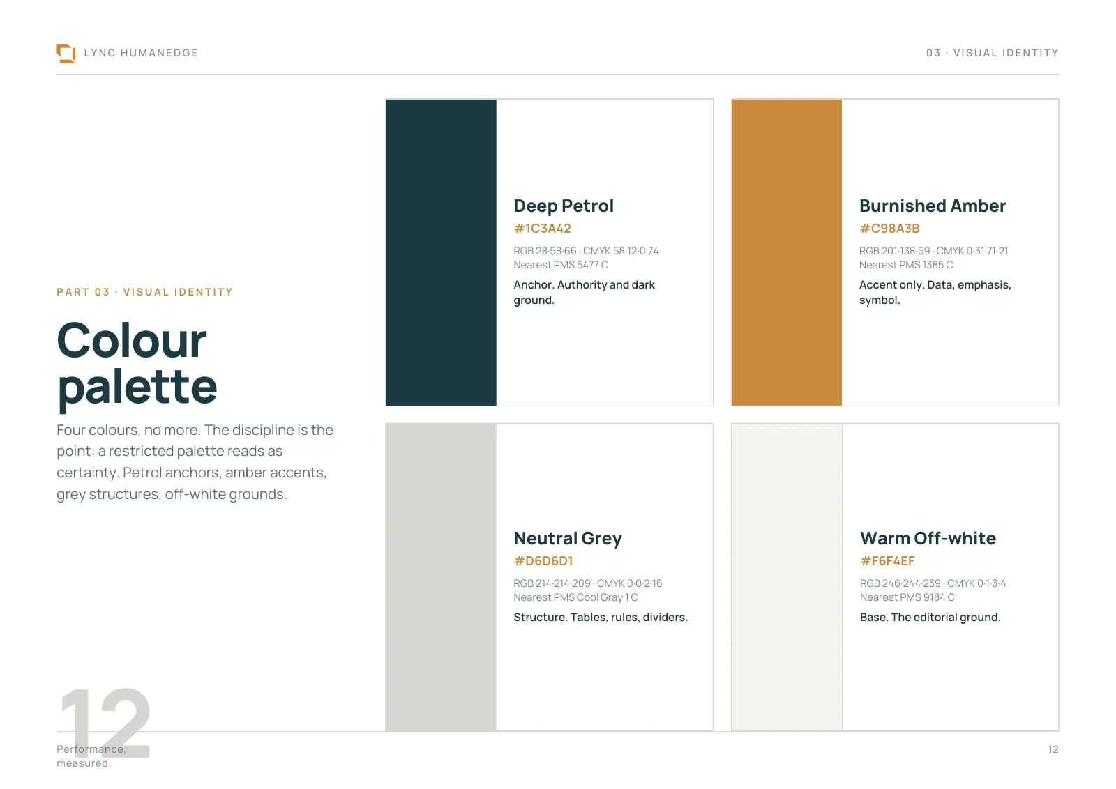
A 23-page brand book: the positioning, wellbeing taken out of the perks budget and put into the P&L; a voice that is direct but not blunt, precise but not cold; the open frame of the symbol; four colours in fixed proportion, amber kept for data and emphasis; Manrope; and the rules for photography and charts. Then every page of the website, written and designed, its words approved by Lync HumanEdge before we built anything.
What we did, in order
Strategy, brand, words, design, code, content and search: every step by our own team.
The brand
The thinking and the identity in one book: the positioning, the voice, the symbol, the colours and the type, and how each is used.
Every page, written and designed
The whole website set out word by word and page by page, for Lync HumanEdge to read and approve before anything was built.
A few working ideas to choose from
Not pictures of a homepage but working ones, each a different idea, so Lync HumanEdge chose with the real thing in front of it.
The Workforce, chosen and built
A thousand marks, one per person, where absence is a gap: Lync HumanEdge's argument on a single screen. We built it, and the whole site around it, in light and dark, from scratch, since no off-the-shelf builder could draw it.
Content, search and the legal pages
A content system for Lync HumanEdge's articles, a contact form on the site's own server, the legal pages, researched against UK law, and a full search review, with structured data on every page for search engines and AI assistants.
Every figure traced to its source
Each statistic on the site checked where it was published and linked there, then a full review of the code, every finding fixed.
Insights, written by our team
The first article, on the £24bn problem hiding behind absence figures: 2,342 words, 3 charts and 7 published sources, in charts, key takeaways and a sources list we built into the content system.
What it measures
The live site, measured by Google's public test, which you can run yourself, and the work behind it, from the project's record. The test's fourth score, for search, counts from launch day.
100
in performance, accessibility and best practices, on a phone and on a desktop
Google PageSpeed Insights, Lighthouse 13.5.0, lync-humanedge.vercel.app, 4 October 2026 Check it (opens in a new tab)
1.2 s
to show the largest thing on screen, on a phone, with nothing blocking the page as it loads
Google PageSpeed Insights, 4 October 2026 Check it (opens in a new tab)
19
pages of words and design, set out for Lync HumanEdge to approve before we built anything
The website preview, 14 August 2026
0
cookies on any of its 10 pages, and nothing kept in a visitor's browser
The live site, 10 pages checked, 4 October 2026
0.3 s
to show the largest thing on screen, on a desktop Google PageSpeed Insights, 4 October 2026
0
layout shift: nothing jumps while the thousand marks are drawn Google PageSpeed Insights, 4 October 2026
7
published sources behind the first article's figures, each one linked The first article, 10 September 2026
124
faults planted to prove the site's own checks, every one caught The project's fault suites, 10 September 2026
Want a launch like this?
Book a twenty-minute call. Tell us what you're working on, and we'll tell you whether we can help and where we'd start.